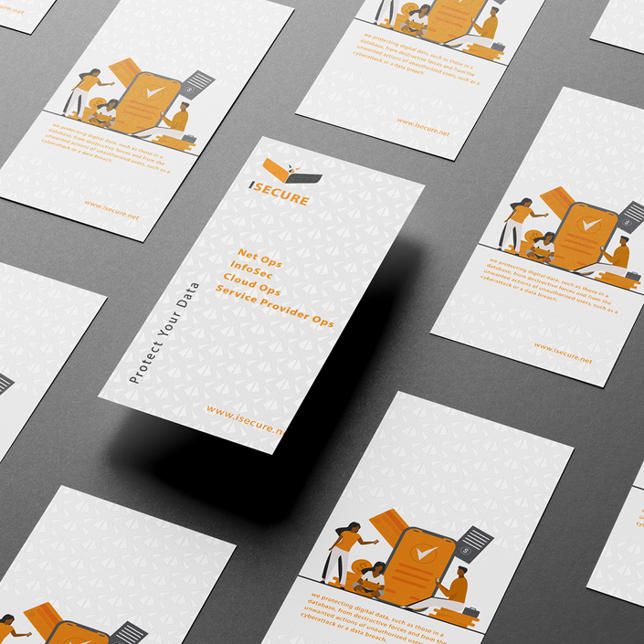
I Secure - Data Security Co.
Throughout the past year, I had the privilege of collaborating with I Secure Agency on a branding project. My primary responsibility was to create a logo that accurately reflected the company's brand identity. After conducting thorough research and comprehending the company's values and mission, I designed a logo that received positive feedback from both the client and customers. As a result of successful work on the logo, I was then approached to design their booth exhibition branding, which exceeded the client's expectations. The bird symbol in the I Secure Agency logo represents the company's commitment to safeguarding its customers' sensitive information, and I spent a great deal of time considering the best way to visually represent this idea.
Service
Identity & Branding, Print, Booth Exhibition.
Client
I Secure
Year
2019

Our company values the color orange as it represents our core values of enthusiasm, hard work, and success. It serves as a reminder of our commitment to providing high-quality services to our customers. On the other hand, the color gray symbolizes balance, sophistication, practicality, maturity, and reliability, which are equally important to our company's ethos. We believe that these values are essential in ensuring customer satisfaction and safety.

When it comes to selecting colors that complement each other, it is important to consider the pairing of orange and grey. While it is true that orange can be paired with both black and white, it is when it is with grey that it truly stands out. This is because grey is a cool color that is more closely aligned with purple and blue, both of which are complementary to orange, rather than white or black.
The result is a visually appealing combination that is both striking and sophisticated. Therefore, if you are looking to create a color scheme that is sure to impress, it is highly recommended that you incorporate orange and grey into your palette.


